
Redesigning a patient experience management homepage into a data-driven dashboard
My role
Role
UX/UI Design
User research
Design system
Information architecture
Impact
Improved user navigation and module discoverability
150% increase in client user engagement
Timeline
4 months
Overview
What is XAmplifier?
Layline (fka XAmplifier) is a cloud-based Customer and Patient Experience and Reputation Management platform. Before the redesign, the homepage primarily served internal users and lacked functionality for a broader audience. The objective of this project was to transform the homepage into a more engaging and functional entry point, attracting more client users to the platform and encouraging interaction across other parts of the software.
Problem
Healthcare personnel need a clear view of performance and patient reviews.
The homepage lacked clarity, leaving them disconnected and unsure how to improve their reputation.
The hompage prior to the redesign
Business goal
Drive engagement and reduce support needs by making the homepage a clear, empowering experience for clients
Research
Desk research
I started by analyzing 10 competitors’ homepages, spotting trends like customizable dashboards, prominent NPS displays, and clean, data-focused layouts.
Lo-fi demonstrating identified user mental models and information architecture
Quantitative data
Hotjar and Google Analytics revealed that users spent most of their time in Reputation Management and Customer Experience modules, with review responses being the top action. This indicated that users relied heavily on understanding customer feedback and maintaining their online presence.
→Users needed fast access to sentiment and a way to respond quickly.
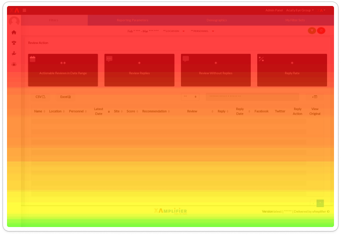
Scroll heatmap
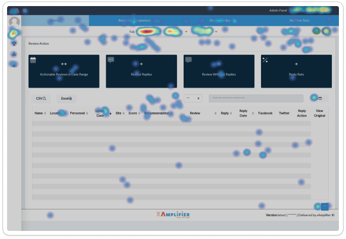
Click heatmap
Qualitative data
To understand how these behaviors connected to users’ goals, I mapped interviewed users and mapped their workflows. This revealed that the metrics they depended on most for daily decision-making were NPS, Review Star Rating, Review Volume, Response Rate, and GBP data. These data points helped them gauge customer sentiment, track performance trends, and quickly identify where action was needed.
→These insights directly shaped the information hierarchy and module-based layout of the redesigned homepage.
Findings & moving forward
User segments
In synthesizing this research, I identified two distinct user groups and their varying needs from the homepage.
→The homepage needed to support both high-level performance monitoring and fast, task-driven action.
Process
Collaborative design
Ideation was a collaborative process. I ran workshops with internal users, PMs, and the CEO to iterate on wireframes, align on information hierarchy, UI, and key data points. Every design decision focused on a high-level performance visibility for executives and actionability for daily users.
Wireframe iterations explored during collaborative workshops
We aligned on key data points for each module card and the overall layout.
Wireframes from workshops. The wireframe on the right reflects the final overall layout.
A modular card approach with clear entry points into each module benefitted both the user and the business.
Another critical element
Because timely responses mattered, the design needed to make recent reviews and survey feedback immediately visible and actionable. To support this, I introduced a dedicated data feed—an essential element for on-site staff whose daily work depended on staying on top of customer sentiment.
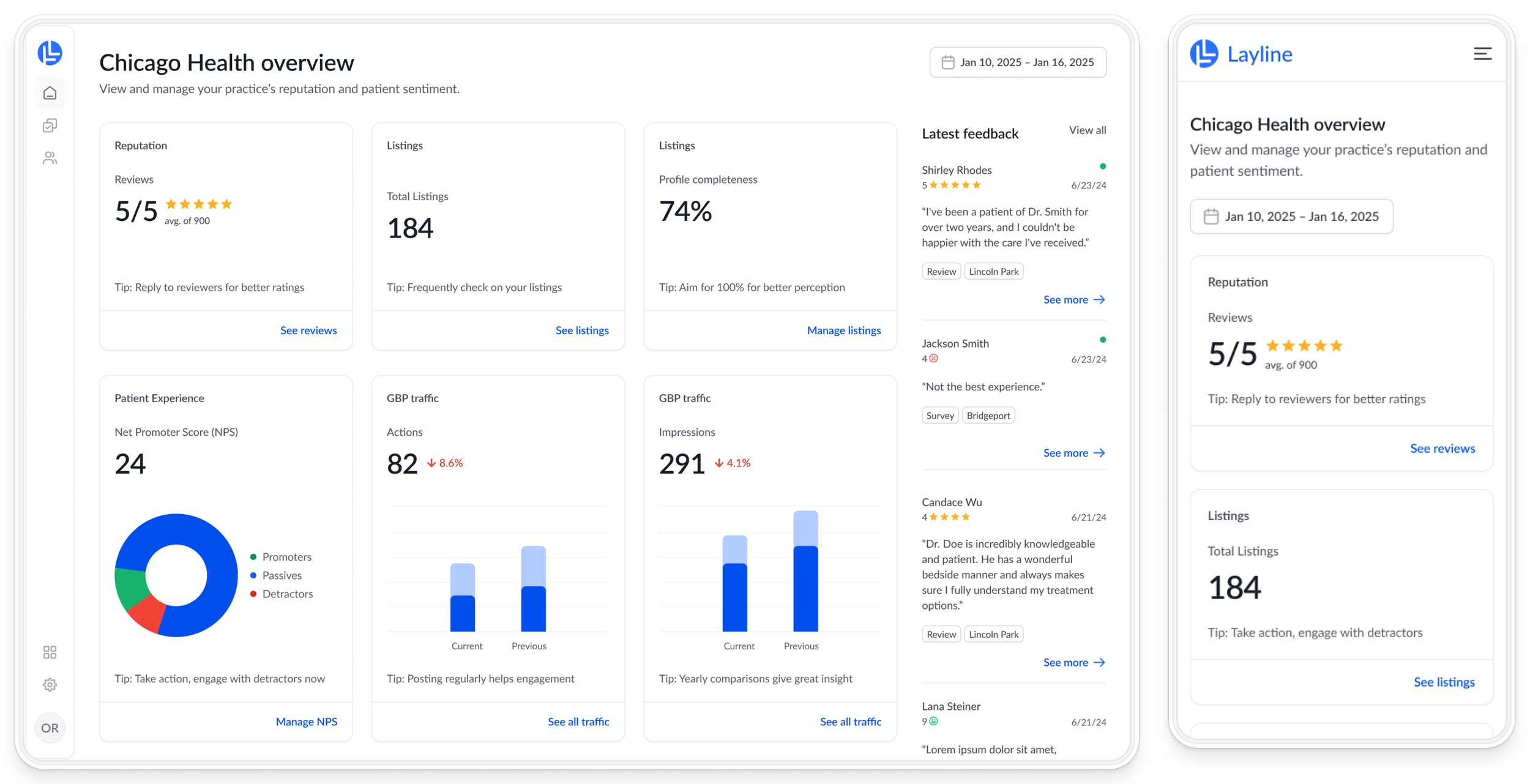
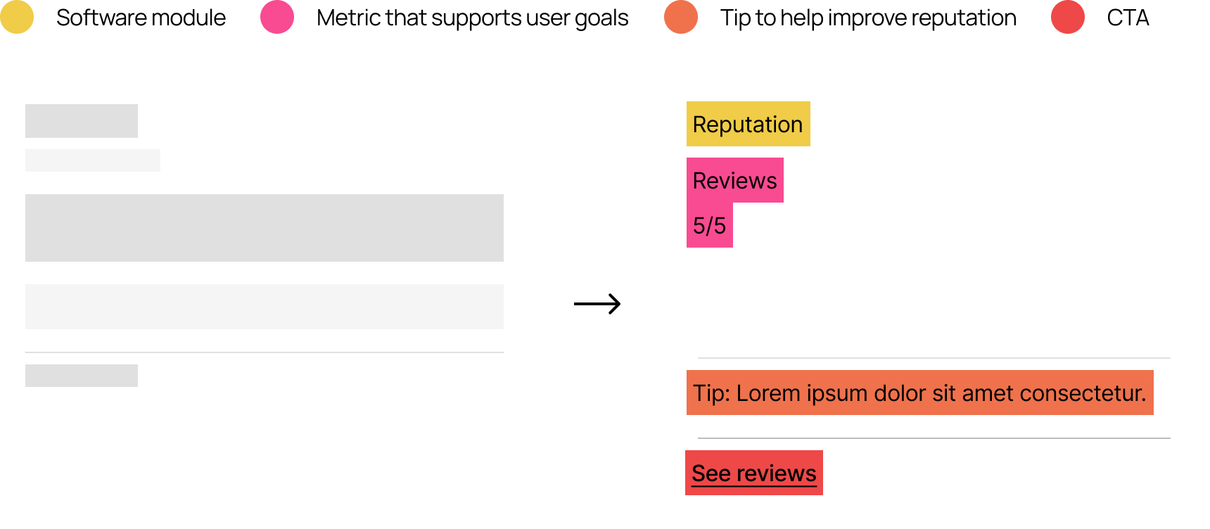
The Solution: A Digestible, Data-Driven Dashboard
Cards to group software modules
Tips to boost confidence and engagement
Digestible data visualizations for both user groups
Data feed for quick information & action
Scores & ratings provide for patient sentiment at a glance
Practice location customized by user groups and permissions
Before
Outdated UI
Non-functional elements
No CTA
Unclear icons and language
After
Modern UI
Interactive elements to bring users into software
Clear CTAs for quick review & survey responses
Helpful & relevant visuals and language
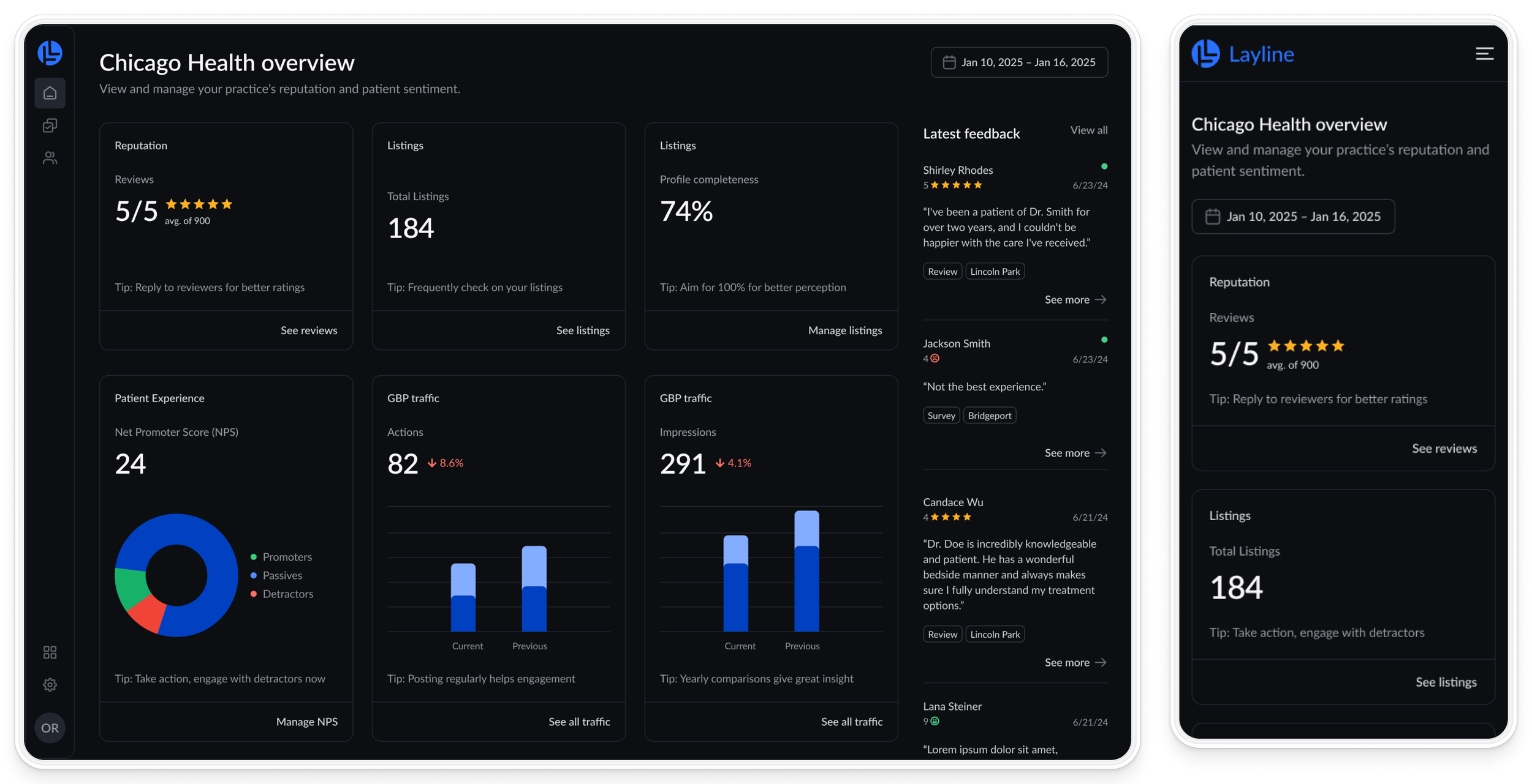
Mobile
Mainly used be executive level users
Prioritizes high-level data for quick look into all locations
Impact
→150% increase
in client user engagement via new homepage within the first month
→Usability gains
users can navigate and act more efficiently
We would also track:
→Task Success Rate - Track % of users that successfully respond to surveys and reviews
→CSAT - Collect feedback to measure user satisfaction