
Transforming a patient guest screen to streamline patient experience management for 1,700+ practitioners

Overview
XAmplifier is a B2B healthcare SaaS company focused on enhancing patient experiences and managing reputation. By leveraging the software to proactively address feedback, clients can boost positive online reviews. In Spring 2022, I spearheaded a complete redesign of the most visited page and experience within the software: the patient guest screen.
Role
Lead UX Designer - Research, Interaction design, Visual design, Prototyping & Testing
Timeline
3 months
Impact
Highly praised by key stakeholders
Increased feature adoption
Positive feedback from internal and end users
The Problem
Users are taken to the guest screen via email alerts after a patient completes a feedback survey. Both internal and client users found the screen confusing due to irrelevant information overload. The survey results were not highlighted effectively, leaving users unsure how to take action without extensive trial and error.

1.1 Original guest screen where users were taken to when they received a survey or review alert via email.

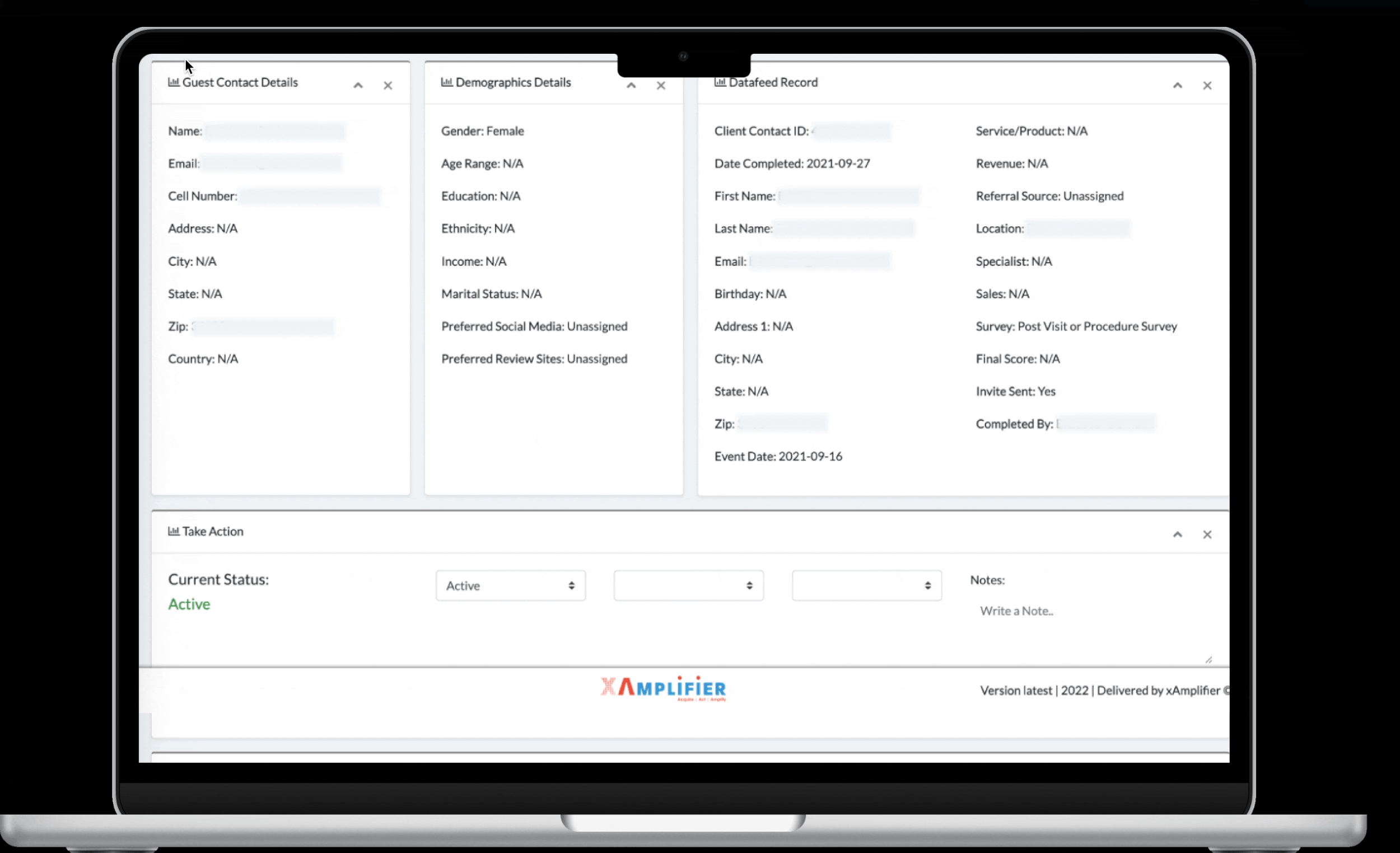
1.2 Original guest screen - Information tab.
The Challenge
Redesign both mobile and desktop versions of the Guest Screen so clients can easily view patient information, send survey invitations and ultimately improve customer sentiment.
How might we improve the Patient Guest Screen to help users easily respond to feedback (take action)?
Research
With limited time and resources, my main goals were to figure out why our users need this page, what they currently do, and how I can help them reach their goals.
In my desk research, I discovered some key contributing factors as to why this software is so important to businesses (our clients).
86% of customers hesitate to purchase from companies with negative reviews.
45% of consumers say that they're more likely to visit a business if it responds to negative reviews
Medical practices are strictly limited in how they can communicate with a patient in a public forum
Thus, negative reviews left untouched lead to: scaring customers away, loss of revenue, decline in reputation, decline in search engine ranking, and lost potential.
I spoke with our CEO / key stakeholder and conducted some user interviews. Here’s what they had to say:
“I want to be able to quickly contact the client”
“I want to be taken directly to the notification the email was referring to”
“I should be able to easily see the most recent patient information”
“I’d like to view an entire survey”
Everyone wants our users to be able to take action: send a survey invite, request a review, make a phone call— ie. make sure that patients are happy.
User Personas

User persona provided by XAmplifier.

User persona provided by XAmplifier.
Identifying pain points
Our primary users' goal is to improve customer sentiment by quickly responding to reviews. However, this was nearly impossible with the existing experience.
User Flows
Before
User flow prior to redesign. Includes several unnecessary steps, and brings to attention that the user could not even perform the main action and accomplish their goal on the same page.

After
New user flow where they’re taken directly to the survey and can reply from the same screen. Eliminates 50% of the steps.
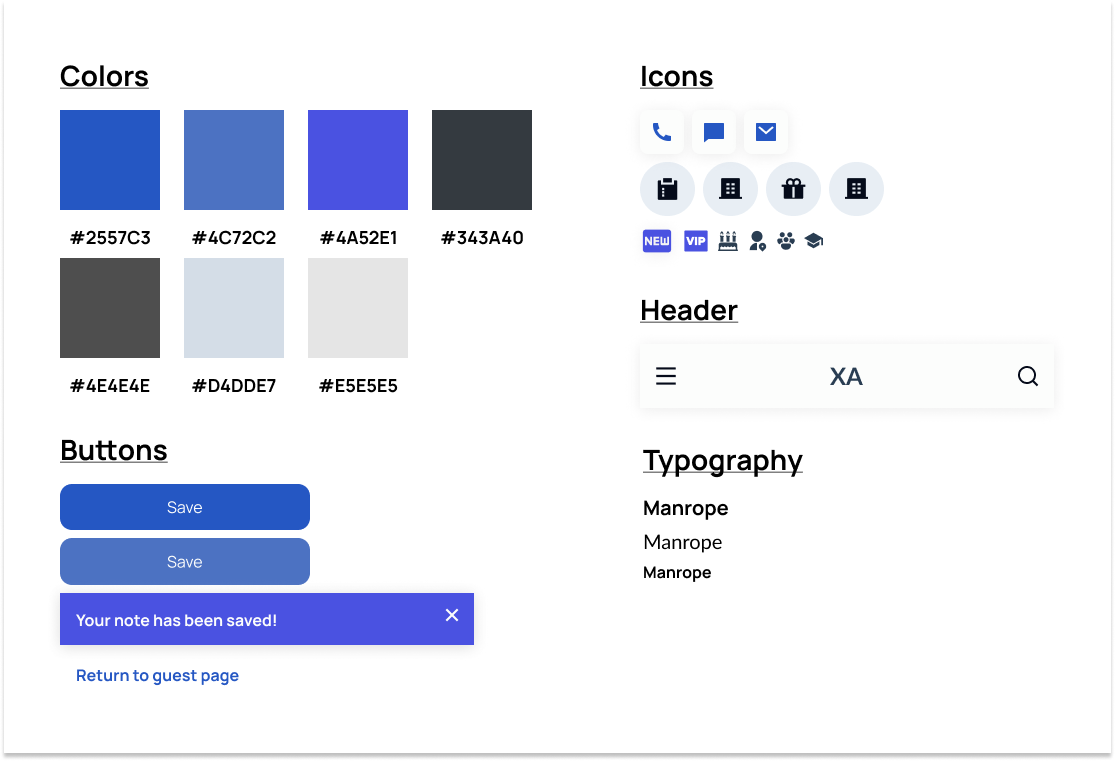
Branding
XAmplifier’s current color scheme is a bit outdated and it is not accessible. Our own CEO is colorblind and couldn’t differentiate between two major colors that were in the current design!
Final high-fidelity designs

Patient survey screen
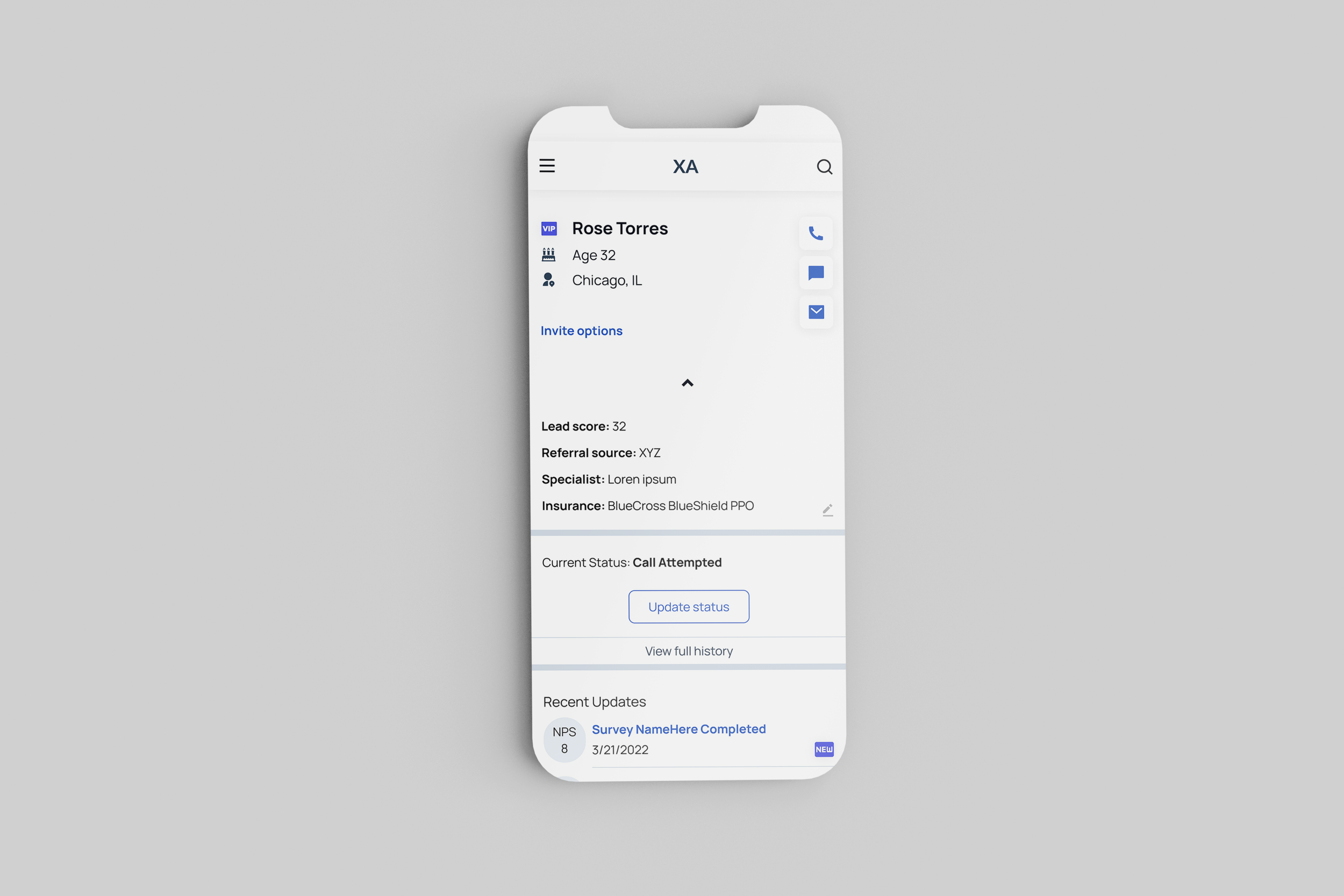
Patient guest screen

Survey invite confirmation
Before
Purpose unclear - what is the user supposed to do?
Information overload
Hard to read
Unnecessary data
Confusing hierarchy
After
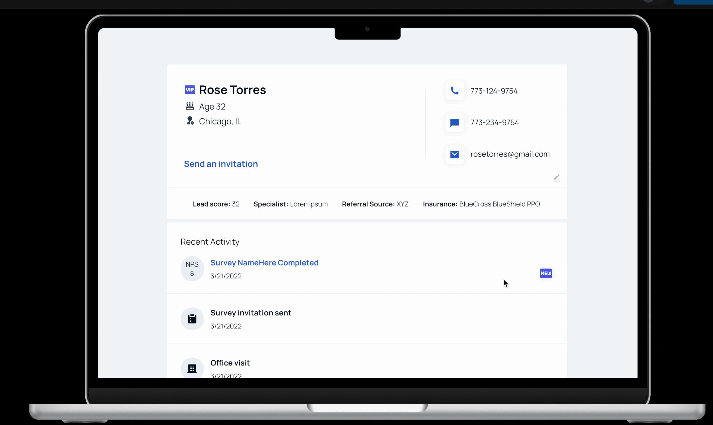
Clear action items
Only necessary and useful information
Easy to read - more white space, icons and visual aids, less distracting buttons
Only relevant data with options to see more
Clear hierarchy and information architecture
Results
The feedback I received from stakeholders and internal users was very positive, especially in comparison to the old design. Users found it “very clean”, “clear”, and “easy to navigate”.
This product has been recently developed and launched and we are currently collecting further user/client feedback.